This is the recent series I am working on, titled Cloud and City Series. My practice is to combine, unify and integrate various art styles. This is an especially fitting style for representing today’s cosmopolitan mega cities with so much diversity and difference. The unification of so much opposites in symbiosis! The complex with the simple. The chaos with the minimal. The noise with the main. The faded with the shiny fluorescent.
Starting towards the end of last year, so far I have completed two paintings and will keep going. I started small (11″x14″ and 12″x12″), and now going bigger with the third one (18″x24″).
The details of the first two paintings are:
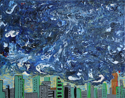
- Cloud, smoke, landmark and a simple city (Cloud and City Series No. 1), Acrylic and Red Enamel on canvas, 11″x14″, 2015.
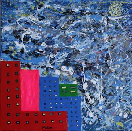
- NYC Downtown with Pollock and Kelly (Cloud and City Series No. 2), Acrylic and Black water-based marker on canvas, 12″x12″, 2016.
The goal of the series is to explore how abstractions with completely different point-of-views (Action Painting and Geometric abstraction) can be combined together for compositions that are representational, bringing out not only the visual aspects, but also the underlying characteristics of the representational subjects.
In No. 1, I explored the basic concepts of combining two completely opposite types of abstractions within a single composition, and went bolder the second painting onwards. Painted the smoke-heavy sky using fluid paints. This was followed by a completely opposite style of painting the city using a geometric Minimalism, and bringing out its lightness. This juxtaposition of effects results in a heavy-crushing-the-light feeling, hinting at city pollutions – especially the city’s historical buildings and landmarks being impacted by that.
In Abstract Expressionism, Pollock stands tall for his pioneering work with drip painting. The effect is very meditational. I am a Pollock fan – and his drips and strings. They are simply a chockful of visual delights, especially with his color palette. His work led to a flurry of work by other artists with drips, splashes, palette knives, spoons, dried brushes and whatever else one could think of! All of these works aided the respective artists with expressing their emotions and inner feelings.
There is an entire range of work that has been done so far. On the other end of the spectrum of Abstract Expressionism, there were works like Cy Twombly and later works of De Kooning being more minimalist in their action-strokes.
But all was not done and finished with abstraction. AE was just one end of abstraction. On the other end of the stick, lay Minimalist Abstraction, like the works of Barnett Newman, Piet Mondrian and Ellsworth Kelly. I am especially fascinated by Kelly pieces. I like Mondrian’s work a lot too.
“Pollock’s art could not have had less in common with that of Ellsworth Kelly,” art critic Charles Darwent reminded us in his article, writing Kelly’s obituary note in Independent.
Of Kelly’s first solo show in New York, Darwent says in the same article:
- “In 1956, Kelly had his first one-man show at Parsons’ gallery. The work he showed there, with each of its blocks of pure colour contained on its own discrete sub-section of canvas, was entirely unlike the wild-eyed, macho mark-making of Pollock and his kind. It brought Kelly instant fame.”
- “If Kelly owed any debt to Pollock, it was in the older man’s understanding of the power of scale, an American sublime. There the similarities ended, though. Where Pollock’s drips and splashes made a fetish of the artist’s hand, Kelly’s unmodulated blocks of colour did everything in their power to deny it.”
While Abstract Expressionism (AE) has been the primary tool for artists to bring out their emotions and inner-side, every aspect of Ellsworth Kelly’s work has been carefully planned and designed after methodical observations of objects and processes. While Pollock’s AE has been an overwhelming representation of chaos, curves, fingerprints and colors, Kelly’s work has been minimal projections of nature and everyday objects represented in their basic elements with minimal color palette. The visual elements of a Pollock piece work out by overlapping field of colors one into the other mixing together in the eye. For example, Lavender Mist (Number 1, 1950) doesn’t use lavender. As per the description of the painting at the National Gallery of Art:
- “Though the work contains no lavender, the webs of black, white, russet, orange, silver, and stone blue industrial paints in Lavender Mist radiate a mauve glow that inspired Greenberg, Pollock’s stalwart champion, to suggest the descriptive title, which Pollock accepted.”
– Go here for the rest of the description.
On the other hand, Kelly’s abstractions are blocks of solid colors without gradational change of value or tone.
In addition, Kelly used to precisely match colors to get the color values that he had in mind. Even some of his paintings are titled by precise shades, for example the painting Red Blue Green (1963) at The Museum of Contemporary Art San Diego, Black Over Blue (1963) at San Francisco Museum of Modern Art (SFMoMA), Dark Blue with Red (Bleu foncé avec rouge) from Suite of Twenty-Seven Color Lithographs
(1964-65) at Museum of Modern Art (MoMA), and a few at The Art Institute of Chicago: Red Yellow Blue White and Black (1953), Blue over Orange (1964-65) and Red Diagonal (2007) (http://www.theartstory.org/artist-kelly-ellsworth.htm).
The art critic Jerry Saltz, who heralds Kelly as The American Matisse, says in his Vulture obituary article:
- “He gives permission to just love color, prettiness, the miracle of chromatic intensities — for themselves and the sensations that seem inherent, internal, part of form itself. It’s hard to overstate just how radical this prettiness is when it comes to modernism and the ways it often comes with backstory, theory, rationale. Kelly makes us revel in something as simple as a large monochrome floating painting and see it not only as a crack into meaning, but also as something that has attained an almost inviolate foreverness.”
– Read the rest of the article here.
About Kelly’s focus on abstraction, Peter Schjeldahl writes in New Yorker:
- “Kelly’s story is now a legend: the art-smitten, bird-watching, shy, gay kid from Newburgh, New York, who served in the “Ghost Army”—camouflage experts who dissembled Allied military deployments before and after D-Day—and was staked by the G.I. Bill to six years in Paris, from 1948 to 1954. There he absorbed Matisse’s mergers of drawing and color, Arp’s methods of composing by chance, and other modern-art innovations. He distilled them into a mode of chaste abstraction based on observed fact: details of architecture, happenstances of light and shadow. Call it Ghost Art, a translation from reality into something fully real, itself, only different.”
Read the full article here.
Kelly’s work is about shapes, projections of shapes in 2D, and borders between solid colors. This is the abstraction of the outer world in its elements – as opposed to the inner world representation of Pollock’s.
At the border of these two very different abstractions, I see ample opportunity – not only for more kinds of abstractions but also for representational art and realism. This is because there are certain things that are perceived and experienced uniquely by each one of us. And certain things that we perceive as same and everybody gets a similar experience. Our real world is a continued juxtaposition of these two types of experiences running parallelly in our lives. For example, everyone seeing the same lines/perspectives of a chair while standing at a particular angle/spot; while the background of the chair may look different to everyone with different sensitivity to color, noise and/or emotion. How do we represent such a daily constant omnipresent experience in a painting?
This is where the opposite abstractions come handy. These two types of pure abstractions can be encapsulated together and crystallized, as if in a quasicrystal, and brought out to represent the real representational world and its multifaces. I think that’s amazing!
The Kelly piece that inspired my No. 2 in the Cloud and City Series is Square: Red, Pink, Blue, Green (1964). It seems to me as perfect to represent the flashy aspect of a city downtown glitterazzi and its omnipresent neons, against everyone’s own piece of sky and escape into imaginations. Every city-deweller is gregarious and solitary at the same time. No. 2 is aptly titled NYC Downtown with Pollock and Kelly.