Continuing on my recent exploration of cityscapes, named the Cloud and City Series, here is the No. 3. The series continues on with my practice of combining different artistic styles from the past and contemporary art. This series unites Abstract Expressionism + Minimalism + Abstraction + Color fields. For the concept and theory behind the series and to see No. 1 and No. 2, see this post.
Details:
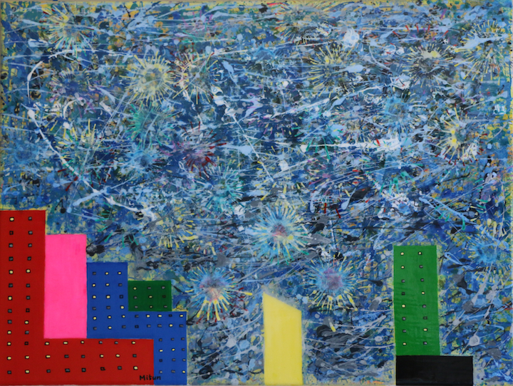
Times Square Fireworks with Pollock and Kelly (Cloud and City Series No. 3), 18″ x 24″, Acrylic and WBM* on canvas, 2016.
* Water-Based Marker compatible with acrylic
Description:
New York City Times Square is positively luminous at night, especially the buildings with their blazing commercials. Particularly in one of the fireworks nights, it is hard to decide whether the glitter lies above in the sky or goes pillaring upwards from land. Cloud and City Series No. 3 explores this tension of excessive glamour, glitz, color and joy. This clash can be perfectly explored by incorporating two completely opposite types of abstraction within a single composition – one emerging from Jackson Pollock’s drip paintings and the other from Ellsworth Kelly’s brightly colored abstraction forms.
The color palette is selected to move the eye in a loop from one shine to the other. And the sky’s alternately placed bright and dark patches add to the illusion of shine and twinkle. I think, one can only see at a time, the light patches or the dark ones.
Especially with subtle and constant changes in ambient light conditions, for example, from day to twilight to evening/night, this painting shifts color spectrum interestingly. Hence it will provide delight of discovery of these effects of time-shifts to the observant viewer.
The luminosity of One Times Square building is a mixture of Hansa Yellow and Titanium White in multiple layers of these two colors and the clear Liquitex (gloss) pouring medium. The completely transparent gloss layer acts as micron-thick refractive sandwiched layers for the illusion of glow, adding to the luminous property of Hansa Yellow, which being semi-transparent, bounces the light off the co-mixed opaque Titanium White making the effect of emanating light complete.
The general color plan was based on the natural properties of color – that cool colors appear to recede and warm colors appear to come forward.
Colors used: Phthalo Blue (red), Pyrrole Red, Phthalo Green (blue), Fluorescent Pink, Hansa Yellow Opaque, Titanium White and Carbon Black.
As I part with this painting, here is a fun fact from the series: Beauty comes with its own wrinkles, cracks and spots, if you care to look for them.